

Designing a fundraiser flyer is a vital part of promoting any fundraising initiative for your charity or NPO. Whether you are hosting an online auction or a picnic with music in the park, you need to ensure that the community is aware of it.
This is where the seemingly humble flyer comes in. Whether you go the printed route or design one for digital distribution, there are certain important design principles to bear in mind.
Here are a few insider tips from design professionals who specialize in layouts and printed material design for NPOs and fundraisers in general:
Living in the digital age has changed the way people consume information. So whether you are designing a digital flyer or one for print, always (ALWAYS) keep your messaging as short and snappy as possible.
Here are a few guidelines on creating fundraising flyers that convert:
TOP TIP: Never use too many fonts. Stick to one or two, and be sure to check that the different fonts are compatible with one another.
Every nonprofit and charity should have a corporate identity. This includes your logo, go-to fonts, brand colors, etc.
When you design marketing collateral, like fundraising flyers, this CI should be top of mind. In short, you want existing donors to take one look at the flyer and know it’s yours.
Establishing a nonprofit brand takes some time, but when you use it consistently it will stand your organization in good stead. If you don’t already have one, work with a graphic designer to establish a CI for your business ASAP.
Ideally, you want a ‘brand bible’, i.e. a document that plots out all your brand particulars. This way, you can induct any new employee and/or designer on your go-to visual approach when need be.

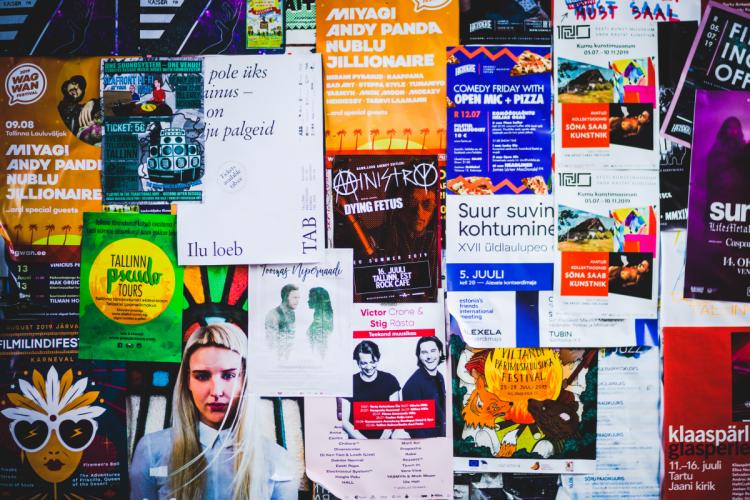
People are drawn to color and pretty images. As such, it helps to add vibrant images to your fundraiser flyer. One good way to get access to quality images that you can use for all of your marketing is to have a professional content shoot.
No budget for something like that? Reach out to your donor pool to see if there is a photographer somewhere in there who might donate their time and skill set.
On the other hand, you could also use stock imagery sites to gain access to professional images to bolster your brand. This is second prize, but a good option if you don’t have any professional-grade images of your own just yet.
Every fundraising flyer should have a simple call to action. Once you’ve done the hard work of getting your reader to buy into your fundraising idea, don’t lose them because your CTA is nowhere to be found.
Decide how you want potential donors to get in touch. Are you sending them to your website to sign up for your fundraiser via a web form or purchase tickets? Or do you want them to email or call you?
Whatever the case may be, be sure that this bit of content is easy to spot. Also triple-check the email address and/or telephone number to ensure that it’s correct.
TOP TIP: Adding a QR code to printed materials is a good way to take a reader from a tactile piece of marketing collateral straight to a digital space by means of their smartphone. You can also use this data to track where your hits are coming from by adding different QR codes to flyers that are distributed to different regions (for instance).
If your fundraiser will be promoted on more than one platform (as it should ideally be), stay consistent with your campaign elements.
E.g. Say you decide to call your fundraiser The Big Bold Run. Use this name consistently on community radio, your social media, website, printed materials, SMS marketing, newsletters, and more to drive the message home across all platforms. Don’t refer to it as the Big Run here, or the Bold Run there.
A flyer does not have to contain every single piece of information about your fundraiser. Nor should it have so many images and colors that it strains the eye.
See it as the hook you use to channel would-be benefactors to your campaign platform, which should ideally be hosted on your website. This is where you can share all the nitty-gritty.

When designing a fundraiser flyer, remember to keep the messaging short and snappy. Bear your corporate identity in mind and embrace color and images. Offer a simple call to action, stay consistent with campaign elements, and don't overcrowd your flyer.
Following these guidelines will allow you to create a fundraiser flyer that draws the eye and inspires would-be donors to action.

Mo-Fri 9 am to 5 pm Eastern Time
24/7 critical emergency support
All currencies supported